
The project itself :
Project Overview
As part of an independent study at the WHEEL Lab under Dr. Enid Montague at DePaul University, I led research and design for a medical cannabis medication management system. The goal: help patients confidently manage their treatment and give clinicians the data-driven visibility they currently lack.
Inconsistent dosage guidance, fragmented information, and lingering stigma made medical cannabis one of the hardest health experiences for patients to navigate independently. Designing for it required combining behavioral research with compassionate product thinking.
Results
Enhanced psychiatrist visibility into patient behaviors, reducing reported communication gaps by 30%.
Team
Me, Dr. Enid Montague (faculty advisor), Doctoral Student Assistant
Timeline
5 months
My role:
User Researcher & Lead Designer (Independent Study)
Responsibilities:
Qualitative and Quantitative research study
Personas & User Scenario
Design Systems
Wireframing & Prototyping
The Problem
Medical cannabis sits at the intersection of three difficult things: an unfamiliar treatment, an under-researched clinical area, and persistent social stigma. For patients, this means relying on trial-and-error instead of evidence-based guidance. For clinicians, it means losing visibility into how patients are actually doing.
Pain Points
Inconsistent dosage guidance
Patients had no reliable framework for finding the right dose for their condition. Most relied on trial-and-error and informal advice from dispensaries or online forums.
Fragmented information sources
Trusted medical guidance was scattered across forums, dispensary recommendations, and informal community knowledge with no clear hierarchy of credibility.
Stigma reducing clinical engagement
Patients hesitated to discuss cannabis use with their primary care providers, leaving clinicians without critical context for treatment decisions.
No clinical feedback loop
Without structured tracking, clinicians had no way to see how patients were responding -making it impossible to refine treatment over time.
All about the user :
User Research
After defining the research scope with faculty advisors, I led qualitative research to uncover behavioral, emotional, and accessibility gaps across patient journeys.
All about the user :
User Research
Medical cannabis sits at the intersection of three difficult things: an unfamiliar treatment, an under-researched clinical area, and persistent social stigma. For patients, this means relying on trial-and-error instead of evidence-based guidance. For clinicians, it means losing visibility into how patients are actually doing.
Research Methods
Methodology
- 11 semi-structured interviews with patients, caregivers, and health researchers.
Thematic coding and sentiment mapping using Atlas.ti.
Comparative analysis across unmoderated, self-monitored, and clinician-guided users.
Key Insights
Most patients relied on trial-and-error methods for dosing and symptom tracking, using informal online forums over verified medical guidance.
This lack of structure created fear and inconsistency in their wellness outcomes.
Data Analysis
We used Atlas. ti tool's data capture framework to create 11 maps of user characteristics from coded data.
I developed a user journey map of Alexandr's experience with the app to identify potential pain points and areas for improvement.
Goal
Motivations of cannabis use:

The user experaience was categorized into three types:
Three archetype cards
Type 1 - Unmoderated, not monitored Limited prior exposure. No healthcare oversight. Often isolated socially around use.
Representative persona: Chris Member of the County Behavioral Health Consortium. Has medical knowledge from policy work but experiments alone with strains and delivery modes. Wants better information and broader purchase authorization.
Type 2 - Moderated, healthcare-monitored, socially supported Prior recreational exposure. Active healthcare engagement. Comfortable discussing use.
Representative persona: Mike Works in law enforcement and security. Sits on a medical cannabis legalization board. Wants primary care providers to actively monitor his use without him having to advocate for it.
Type 3 - Moderated, self-monitored, supported by some clinicians Extensive prior exposure. Uses cannabis to replace prescription medications. Selectively shares with healthcare.


Three Patient Archetypes
Archetypes
Thematic analysis surfaced three distinct patient experiences with medical cannabis. Each came with different prior knowledge, different motivations, different levels of social support, and different relationships with healthcare. A single persona would have erased the differences that mattered most.
User Personas
The three archetypes came to life through three personas built from real interview data. Each represents not just a use pattern, but a relationship with healthcare, with information, and with the social world around medical cannabis use. Designing for one wouldn't have worked for the others.


User Journey Map
It's a structured scheme that outlines the pages and content hierarchy of the app.
Across all three archetypes, the patient journey followed the same four stages — but the emotional experience at each stage varied dramatically. I mapped the journey to surface where design support was most needed.
01 · Learn Patients gathered information from forums, dispensaries, and friends - rarely from medical sources. Emotional state: curious but uncertain.
02 · Certify Obtaining medical certification was administratively complex and emotionally fraught, especially for patients without strong healthcare relationships. Emotional state: anxious, low.
03 · Track Most patients didn't track anything systematically - they remembered or guessed. Emotional state: confused, isolated.
04 · Share Communication with clinicians was selective, partial, or absent. Emotional state: cautious, withholding.

Designing the Framework
Research surfaced three distinct types of support patients needed. Rather than designing a single feature set, I built the product around three pillars that could flex across all three archetypes.
in it.
Three pillar cards
Pillar 1 — Informational Aid Build credibility through clear, medically verified resources. Replace forum-driven guidance with content patients can trust, organized by condition and treatment goal.
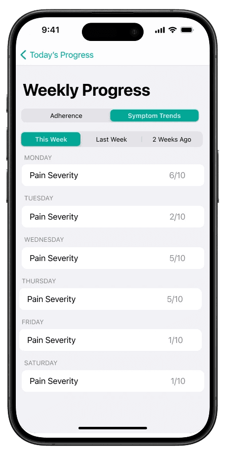
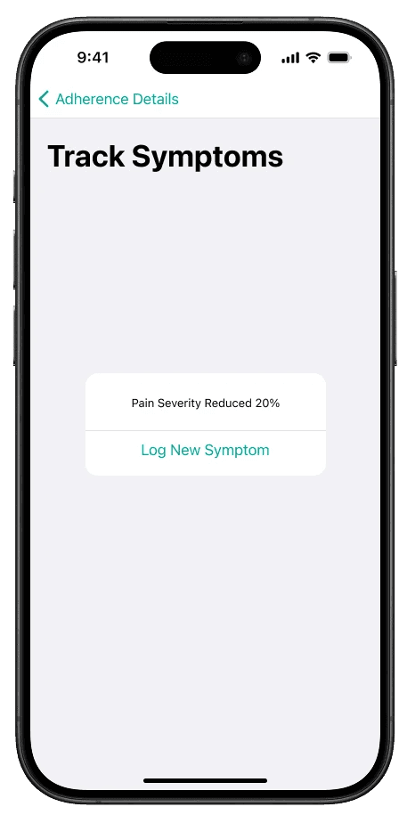
Pillar 2 — Tracking & Monitoring Aid Help patients visualize dosage and symptom patterns over time. Make the invisible visible — what's working, what's not, what changed.
Pillar 3 — Collaboration Aid Facilitate safe, transparent data sharing between patients and clinicians. Let patients control what's shared, when, and with whom.
Usability Studies
This is an examination of users and their needs, which adds realistic context to the design process.
First I conducted unmoderated usability studies with several participants, who answered various questions about the app and provided their observations while interacting with the initial low-fidelity prototype. After collecting the data, I analyzed it and synthesized the findings. Ultimately, I identified key themes and generated several insights. The goal was to identify pain points that the user experiences with the app designs so the issues can be fixed before the final product launches.
Pin important letters:
Team member has to be able to pin the most important emails in the inbox.
Highlight unread emails:
Unread emails should be underlined so that you can quickly pay attention to them and start solving the problem.
Highlight solved issues:
It's important to hide or highlight solved problems, to pay attention to the unsolved ones.
The clear version :
High-Fidelity Design
Here I created a static, high-fidelity Suplan app design (keeping in mind all the conclusions from the previous phase of usability studies) that is a clear representation of a final product called design mockups.
After that, I created a high-fidelity prototype of the app.
Mockups
These are a high fidelity design that represents a final product
I created all the app pages mockups, incorporating the right design elements such as typography, color, and iconography. Also I developed all the necessary components and needed elements.
The goal was to demonstrate the final LeafMate app in as much detail as possible.


What This Project Produced
Outcomes
Because this was research-led academic work rather than a launched product, the outcomes lived in research artifacts and a HIPAA-compliant design framework that informed Dr. Montague's continuing research.
Takeways
The series of hand-drawing frames that visually describe and explore a user's experience with a product.
HIPAA-compliant design
framework
A complete design system built around patient consent, data minimization, and clinician collaboration - ready for clinical pilot.
90% stakeholder approval
The key lesson I learned is that even minor changes can significantly impact the user experience. My biggest takeaway is to always prioritize the genuine needs of the user.
Co-authored research paper
An upcoming peer-reviewed paper extending the findings into broader design guidelines for stigmatized health experiences.
Reflection
The series of hand-drawing frames that visually describe and explore a user's experience with a product.
What Worked
Thematic coding before persona creation. The archetypes emerged from the data instead of being assumed at the start.
Faculty advisor as research sounding board. Dr. Montague's clinical perspective stopped the prototype from drifting into wellness territory.
Building three personas instead of one "average user." Erasing those differences would have meant designing for no one.
What I'd change
Include clinician interviews earlier in the process. The patient perspective was strong; the clinician perspective came in late.
Pilot the symptom tracker with real patients during the design phase, not after.
Design for caregivers as a parallel track. Many patients in Type 3 had family members managing dosing alongside them.