Fintech
Digitally Inclusive Design: Modernizing Golden1 Union's Banking Experience
ROLE
UX Designer
COMPANY
Golden1 Credit Union
TIMELINE
Jan 2024 - Feb 2025
Project Summary
In collaboration with the team, I led the initiate of making sure that the online banking experience meets WCAG 2.1+ standards, improve usability, and increase engagement across member touchpoints
Company & Role Highlight
Golden1 Credit Union is one of the largest U.S. credit unions, offering a full spectrum of financial services. As a UX/UI Designer, I spearheaded initiatives to overhaul digital accessibility, integrating strategic design solutions aligned with cutting-edge brand standards.
Golden1 Credit Union's platform needed upgrades to resolve accessibility issues affecting usability for assistive technology users. Our challenge was to ensure WCAG 2.1 compliance while maintaining brand integrity, amid UI inconsistencies.
Context & Challenge
Redesigning for Inclusive Accessibility:
Golden1 Credit Union, serving over 1M Californians, wanted to make digital banking simpler and more inclusive.
As the Senior UX/UI Design Consultant, I led the redesign across web and mobile platforms, focusing on accessibility, usability, and system cohesion.
Project Summary
Golden1 Credit Union wanted to turn accessibility from a compliance checkbox into a member-first experience and it worked, improving usability, trust, and engagement across platforms.

Process
I led this 6-month remote project from discovery through launch, collaborating closely with 2 product managers, 2 engineers, 1 UX Architect and across 2 time zones.
Month 1 - 2
Accessibility & Usability Audit
Conducted a full audit of Golden1’s digital banking platform to identify pain points and compliance gaps.
Benchmarked current performance against WCAG 2.1+ and user engagement metrics.
Month 3 - 4
Research & Feature Prioritization: Partnered with stakeholders to prioritize accessibility fixes and high-impact UI improvements.
Month 5 - 6
Design System Development & Prototyping
Standardized UI components to align with ADA and brand guidelines- reducing inconsistencies by 25%.
Created high-fidelity prototypes for mobile and web, enabling faster stakeholder alignment.
Launch
Testing & Implementation: Collaborated with QA during UAT to validate accessibility and responsiveness.
Research
To identify accessibility gaps and usability challenges, we combined heuristic evaluations, accessibility audits, analytics reviews, and member interviews, gathering both quantitative and qualitative insights across key user groups.
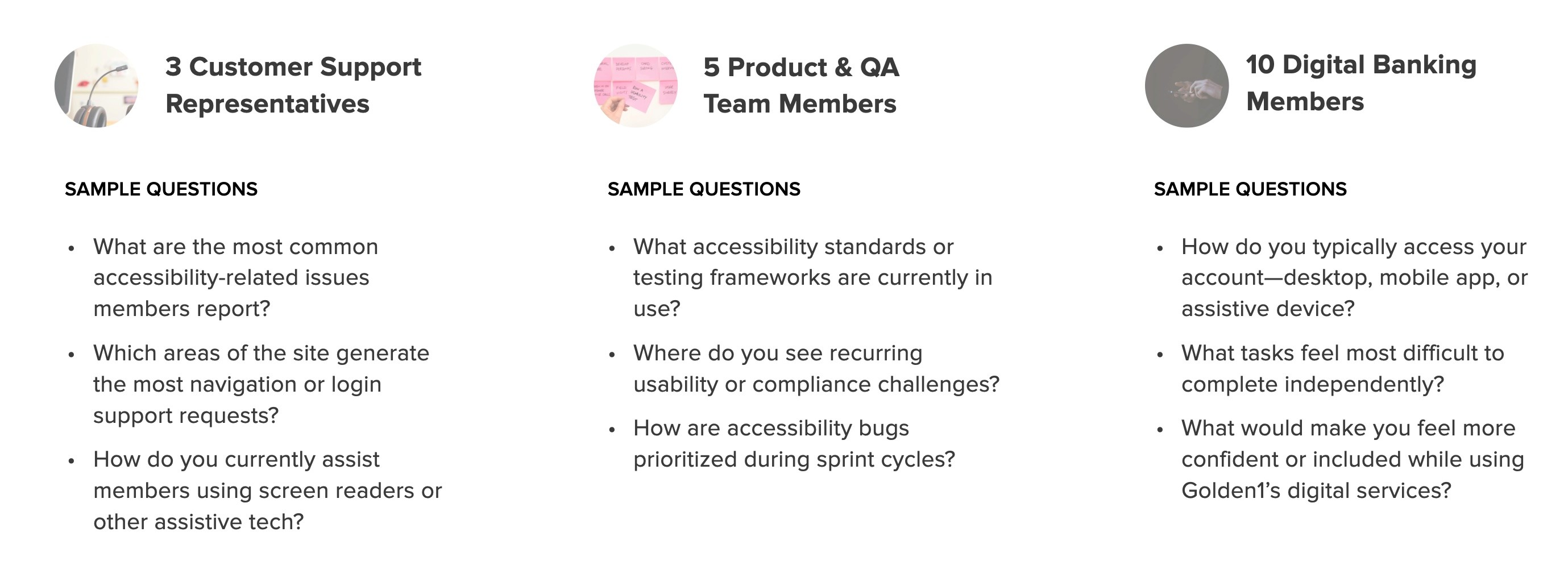
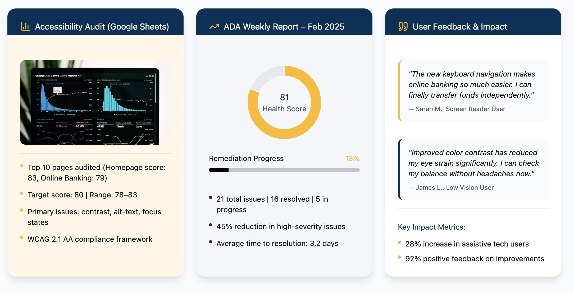
After conducting accessibility audits, analytics reviews, and member interviews, I moved directly into designing actionable solutions.
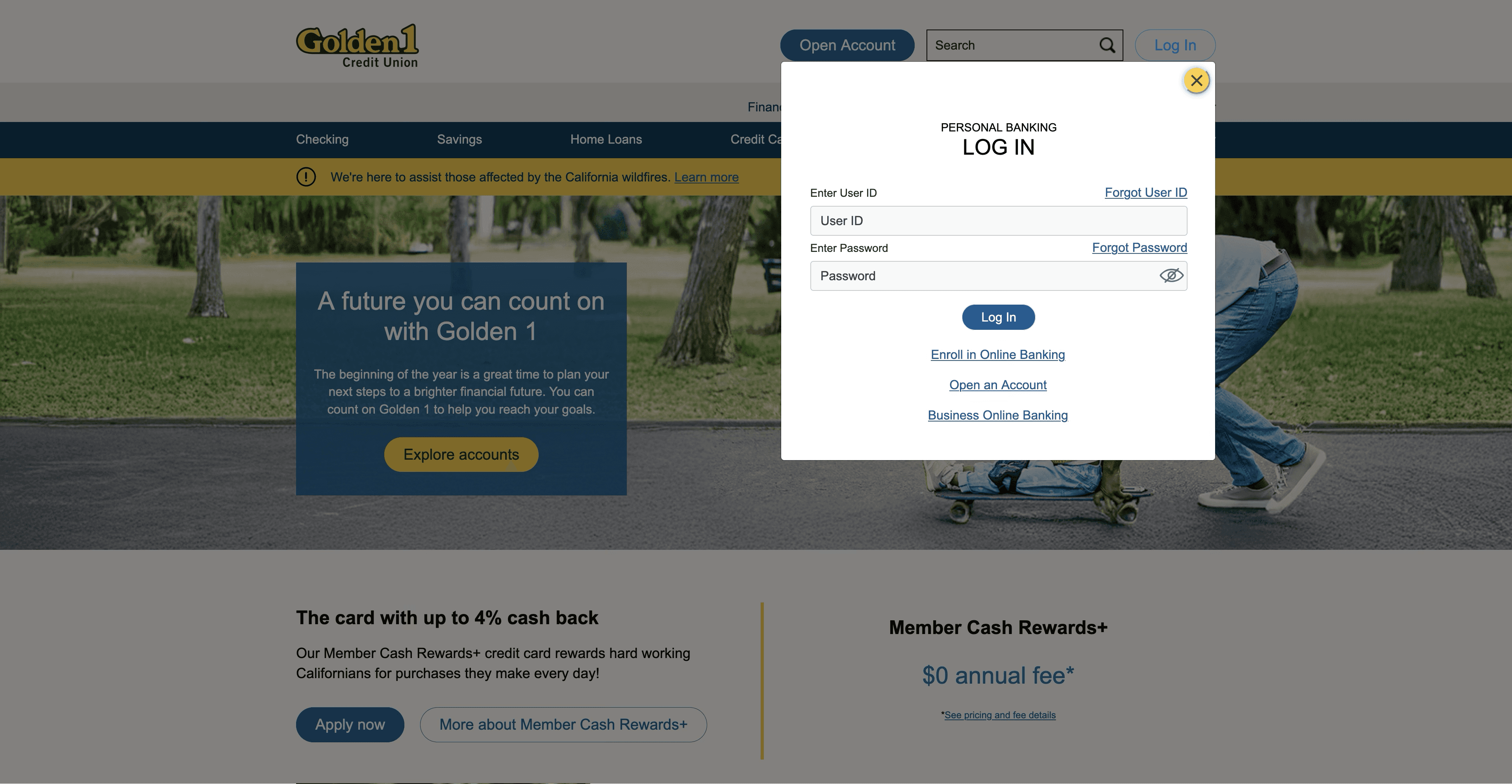
The findings revealed that users, especially those relying on assistive technologies, struggled most with unclear navigation, inconsistent layouts, and low-contrast visuals.
Wireframing & Interaction Design
I began by translating accessibility pain points into new layout concepts focused on clarity and independence.
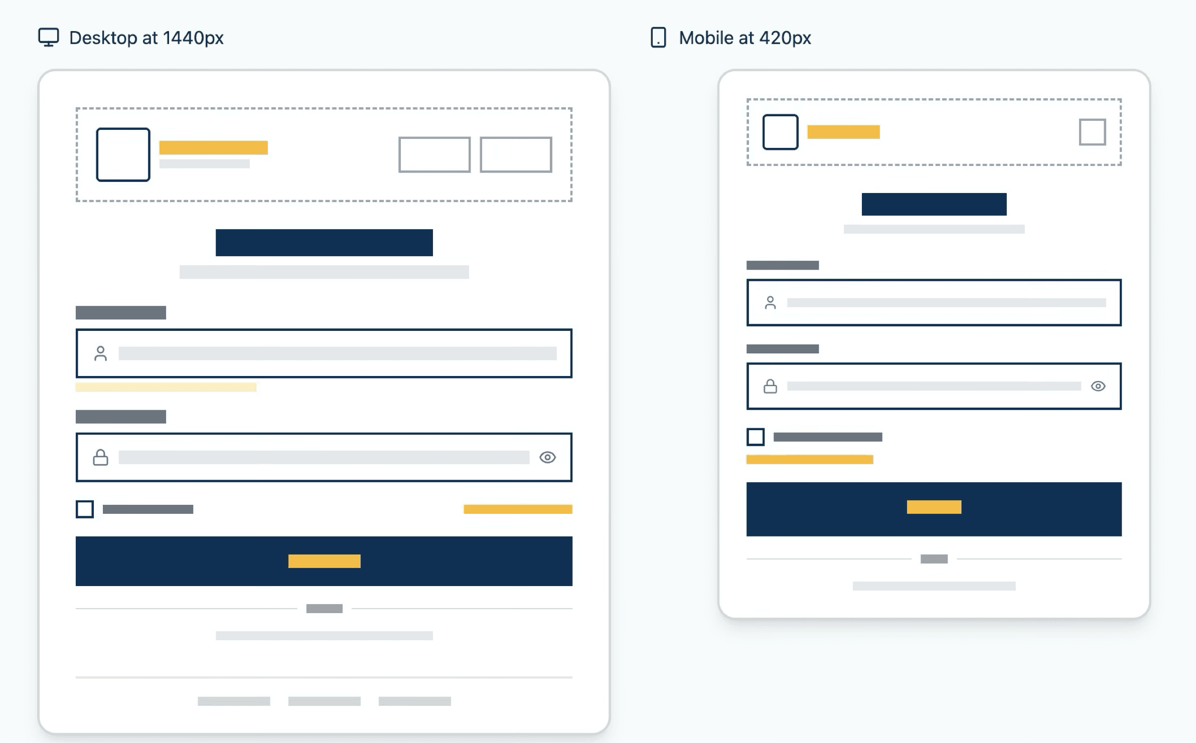
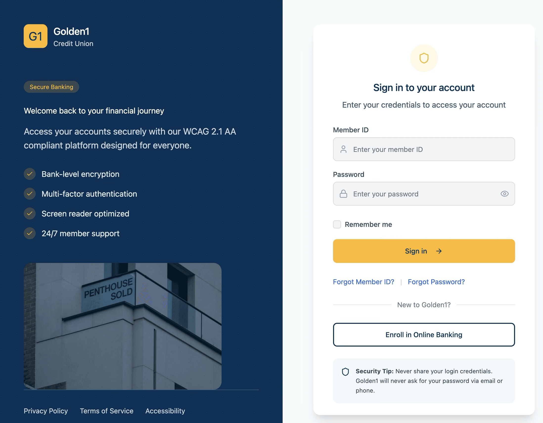
Wireframes emphasized clear hierarchy, larger touch targets, simplified forms, and improved focus states for keyboard and screen reader users.
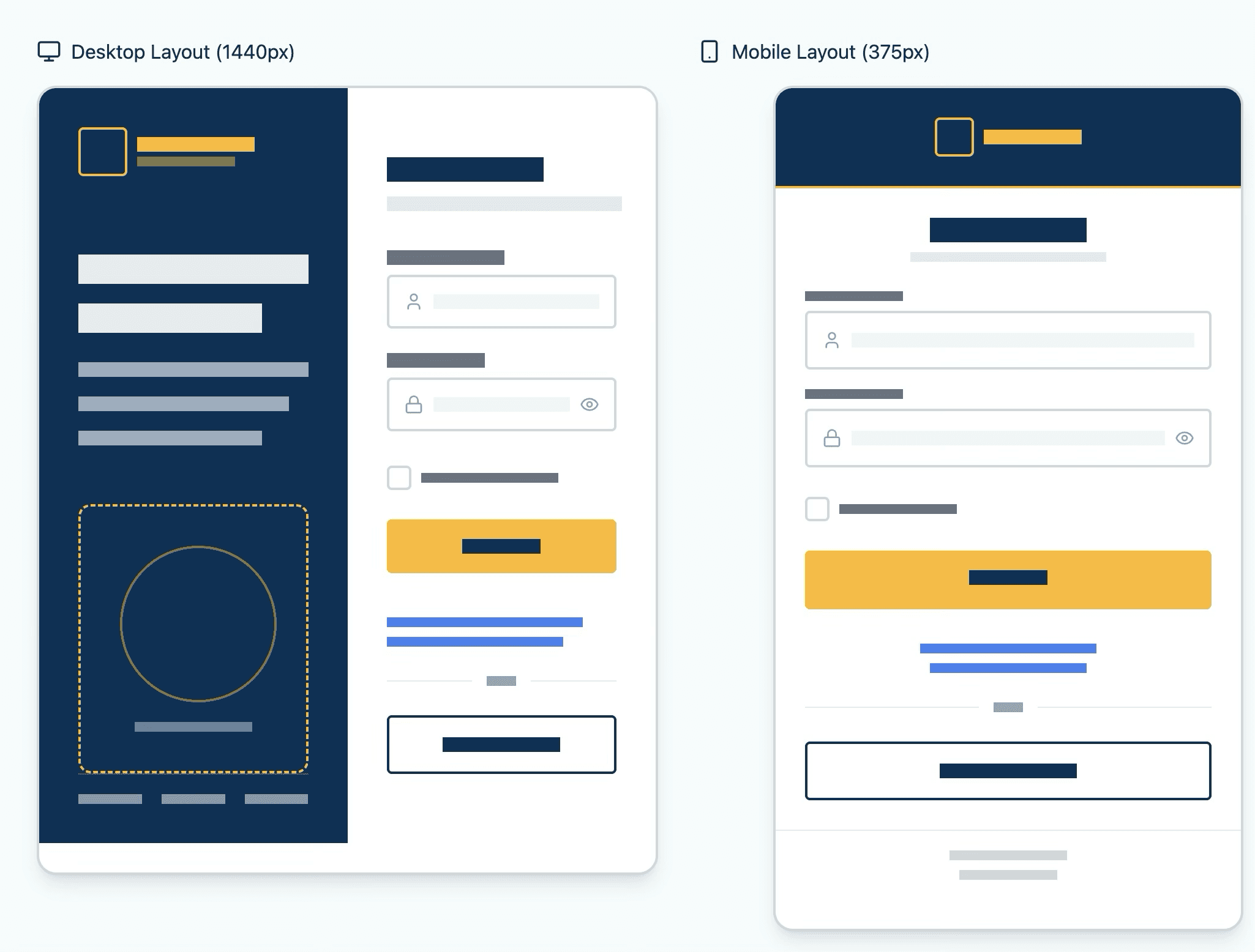
Design System & Accessibility Standards
I built upon Golden1’s existing design system to incorporate accessibility tokens (contrast ratios, typography scale, semantic color mapping).
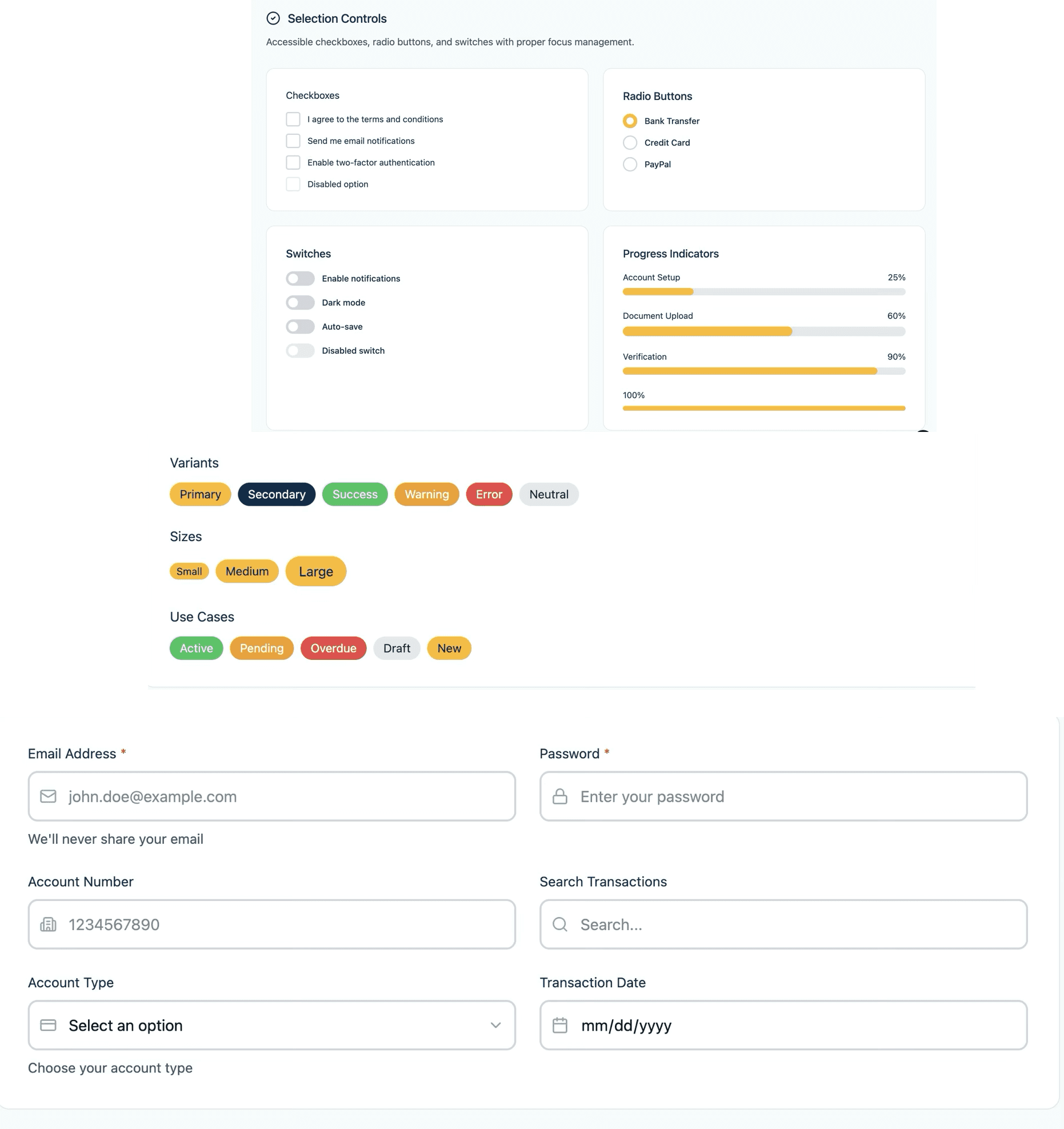
In high-fidelity designs, I applied accessible color palettes, responsive type scales, and consistent button behavior.
I built reusable, WCAG 2.1+, compliant components into the existing design system, reducing inconsistencies by 25% and enabling faster dev handoffs.
Validation & Iteration
Through multiple UAT and accessibility walkthroughs with assistive-tech users, I refined spacing, color contrast, and focus order.
Before
After Re-design
Constraints Narrative
Adapted brand color palettes to meet contrast requirements, balancing aesthetic appeal with accessibility mandates. Removed non-essential animations to enhance performance, prioritizing critical navigation improvements within strict deadlines, ensuring efficient deployment without compromising on quality.
Outcomes & Impact
Significantly improved accessibility compliance by 30%, nearing full WCAG 2.1 alignment. Reduced UI inconsistencies by 25% through standardized component libraries. Enhanced design-to-code cycles by 40%, refining handoff processes, and increased member satisfaction by 20%, with particularly positive feedback from assistive technology users. Looking ahead, ongoing user engagement and iterative feedback collection will remain central to sustaining this progress.
