Enterprise & SaaS (Technology)
Micron Website Redesign: Enhanced Functionality and Accessibility
ROLE
UX Designer
COMPANY
Micron Technology
TIMELINE
Nov 2021 - Jul 2023

Project Summary
In collaboration with the team, I led the initiate of making sure that the online banking experience meets WCAG 2.1+ standards, improve usability, and increase engagement across member touchpoints
Company & Role Highlights
Company Overview : Micron Technology, a leader in memory and storage solutions, serves a diverse global audience with innovative technologies across sectors like computing, mobile, and automotive.
Role Contribution : As a UX Designer, my focus was on leading the charge to revamp the enterprise platform. My responsibility spanned from ensuring WCAG compliance to creating a scalable design system and collaborating across teams to integrate seamless user experience enhancements that align with corporate branding.
Challenge
Micron's platform faced significant usability and accessibility challenges, particularly for users relying on assistive technologies. The goal was to identify and resolve issues like redundant navigation links and low contrast ratios, aligning with industry benchmarks and enhancing user satisfaction.
Process
In collaboration of the team, I worked on end-to-end redesign process from research to launch, aligning design consistency, accessibility, and content clarity across global teams.
The project ran for 8 months, fully remote across three time zones.
Month 1 - 2
Research & Discovery
Conducted heuristic evaluations, accessibility audits, and analytics reviews to identify key friction points across Micron’s website.
Collaborated with stakeholders to prioritize pages with the highest business and user impact.
Month 3
Information Architecture & Strategy
Simplified content hierarchy and introduced modular layouts to improve discoverability.
Reorganized site structure to support faster scanning and better flow between corporate and recruiting content.
Month 4 - 5
Wireframing & Prototyping
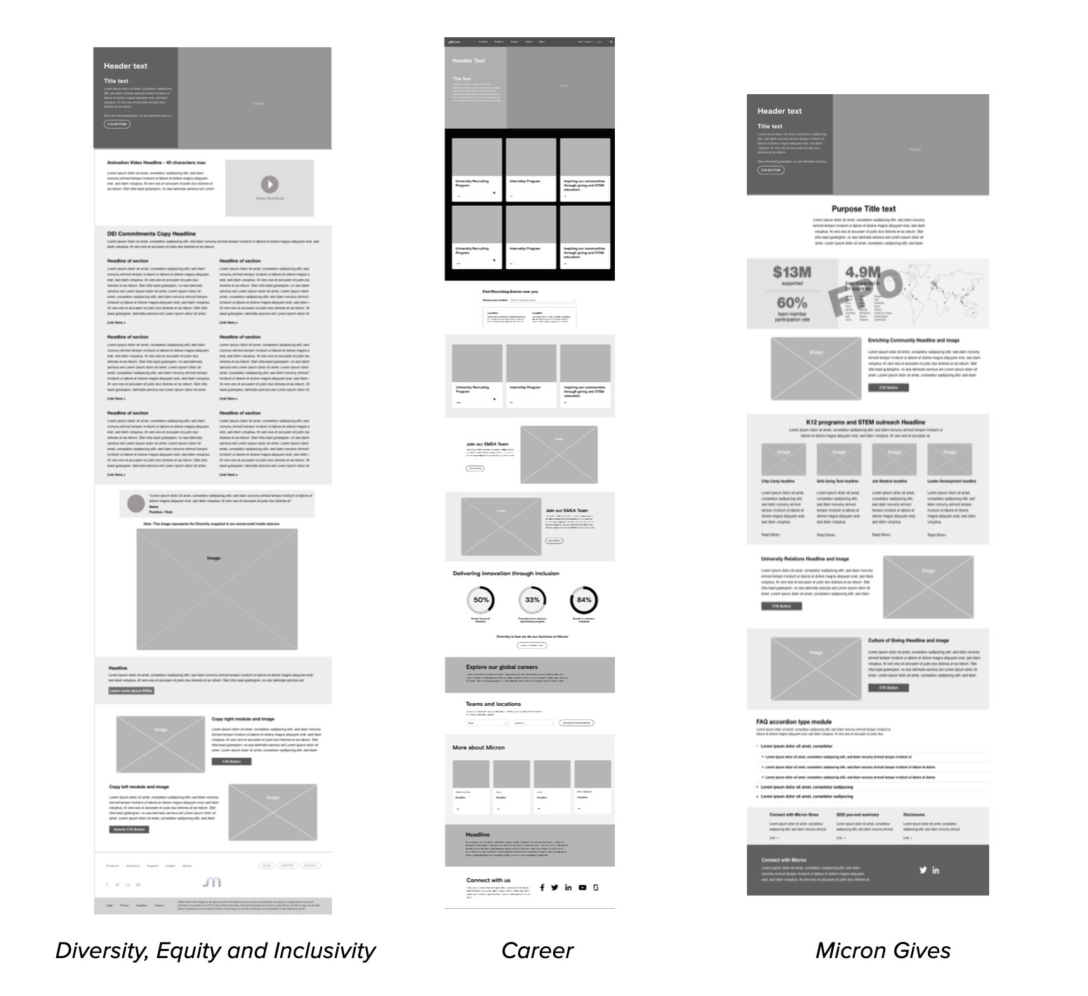
Created low- and mid-fidelity wireframes to test content placement and interaction patterns.
Iterated with stakeholders on layout balance, content priority, and accessibility-first elements like contrast ratios and heading structure.
Month 6 - 7
Component Library & High-Fidelity Design
Developed an atomic design library with reusable components aligned to WCAG 2.1+ standards.
Integrated typography tokens, color systems, and interactive elements to create design consistency across the global site.
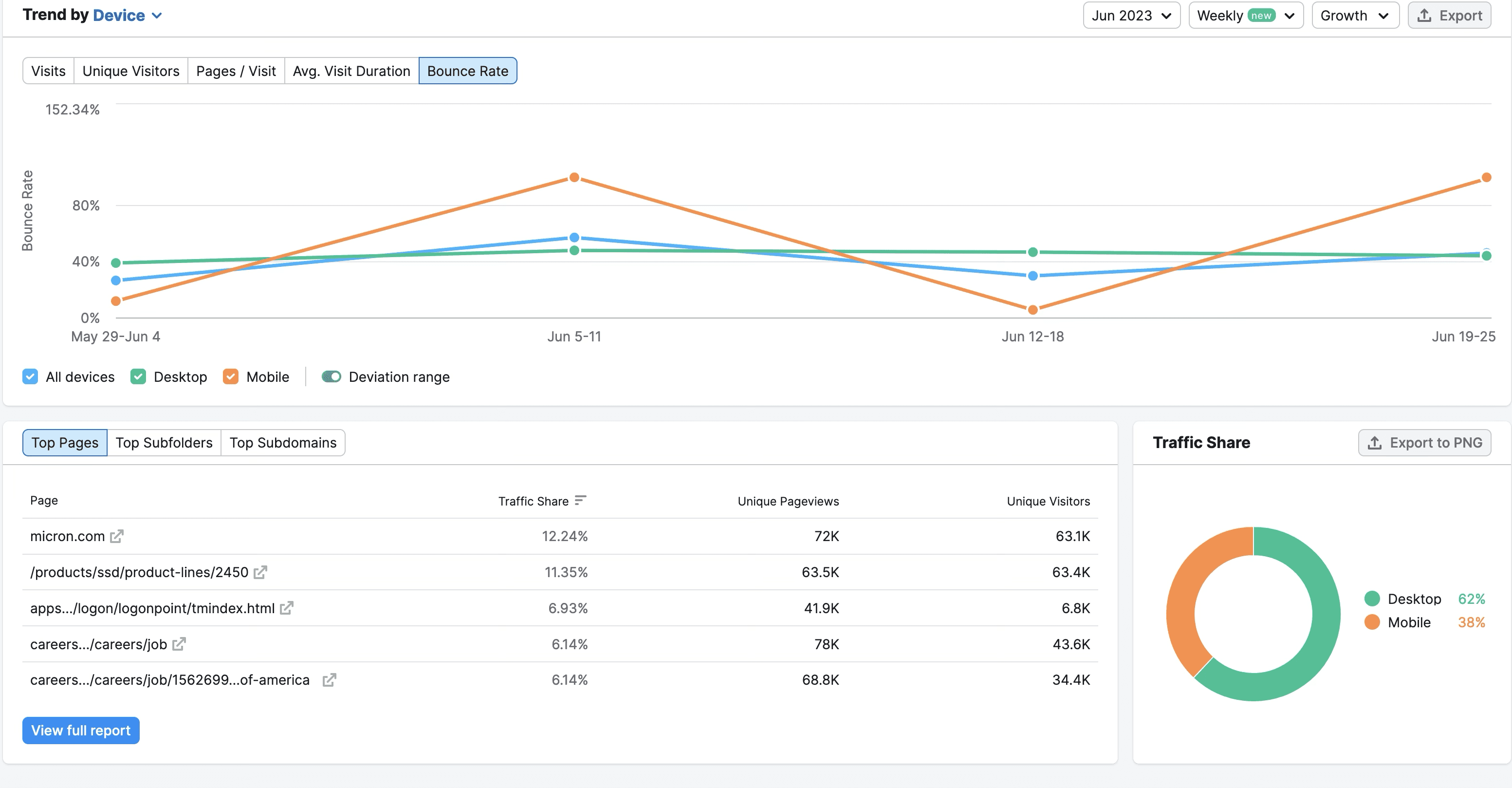
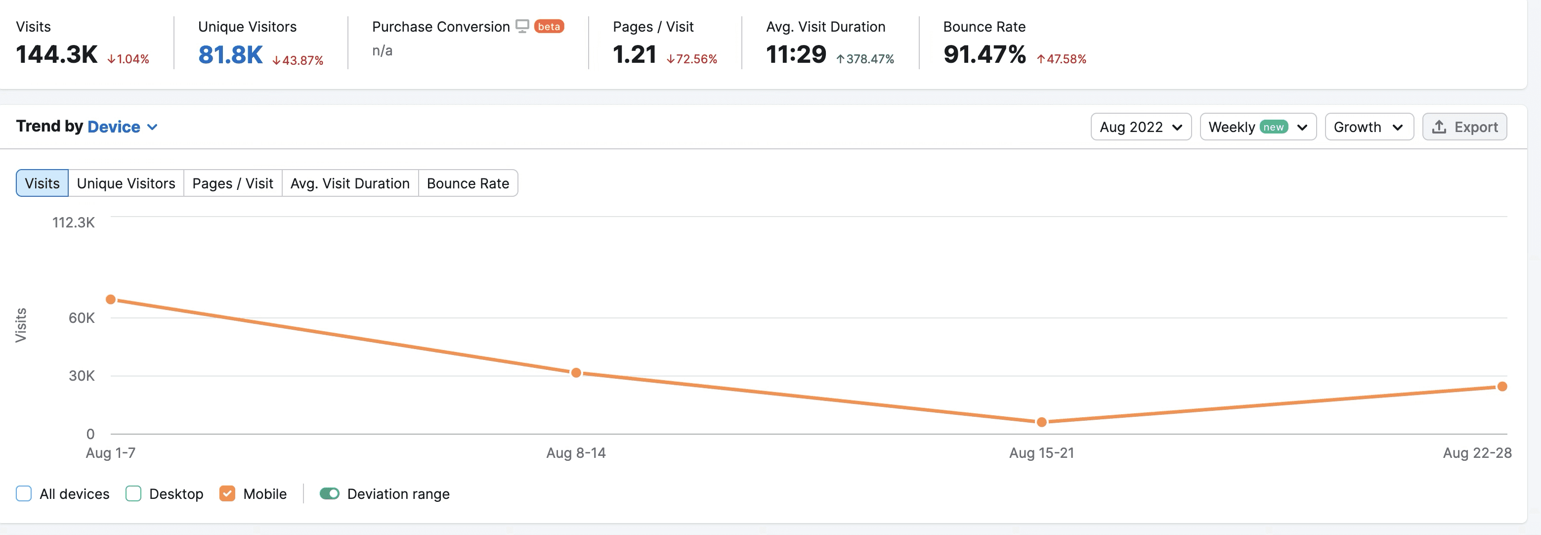
User Research
We began by conducting heuristic evaluations, analytics reviews, and stakeholder interviews to uncover friction points across the website.
The data analytics showed a high bounce rate & unresponsive design
The data revealed that users struggled with inconsistent layouts, inaccessible content, and poor discoverability of key pages like Careers, Micron Gives, and Diversity & Inclusion.
Website pages lacked accessibility to all users, including those with disabilities.
In response to stakeholder requirements, I defined the scope of the project. This included the initial phase of the redesign process, which covers three key pages:
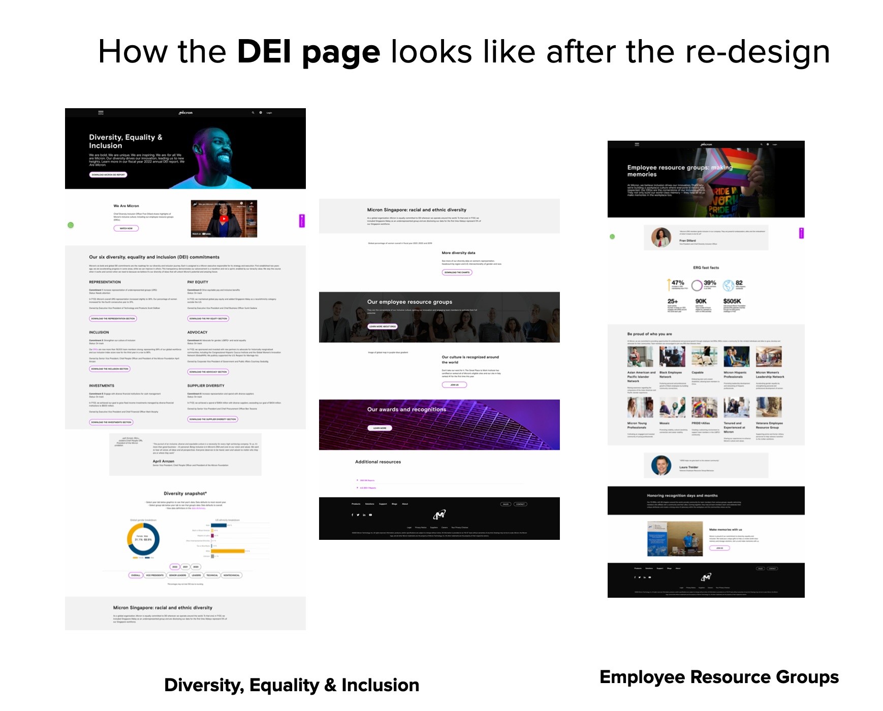
Diversity, Equality, and Inclusion Page
Career Page
Micron Gives
The purpose of these strategy questions was to guide the decision-making and problem solving process for each of the webpages. These questions helped clarify the context, goals, challenges, and potential solutions in various areas of company, including marketing, product development and project management:
Who is the audience?
What business unit/event is this for?
Is this supporting other media that we need to take into account? Videos, podcast, live stream etc.
What are the main call to action?
Experience Design
Two personas were created for key users based on the company's target audience to tailor content and prioritize features and functionalities for diverse users.
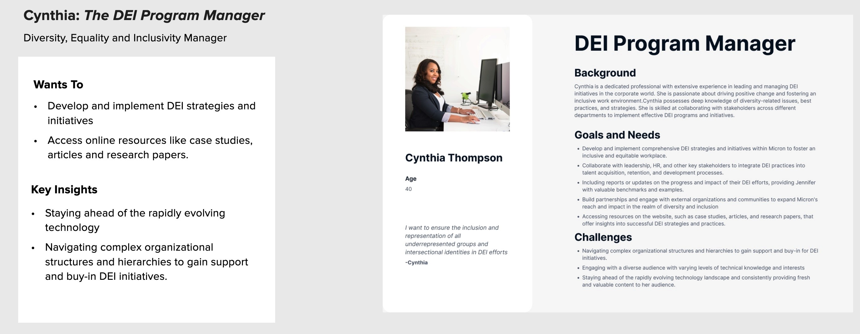
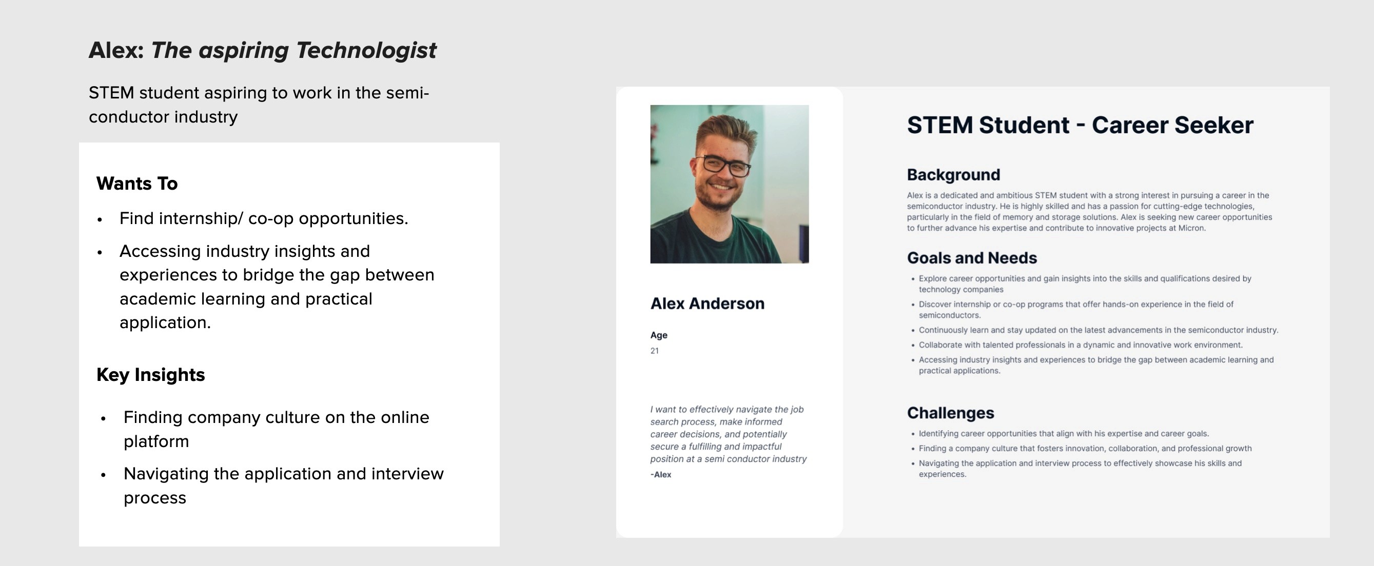
After identifying two user personas, I collected these insights that led to a shift in focus from organization-centered to user-centered.
Feature Prioritization: Decide which features and functionalities to prioritize.
Audience Segmentation: Segment the audience and understanding the distinct characteristics of each group.
Targeted Content and Messaging: Vary requirements and interests of different users, ensuring that content is relevant and engaging for each group.
Our research captured the complete user experience of technical decision-makers-engineers, researchers, and technology buyers, by examining what they say, think, do, and feel throughout their journey.
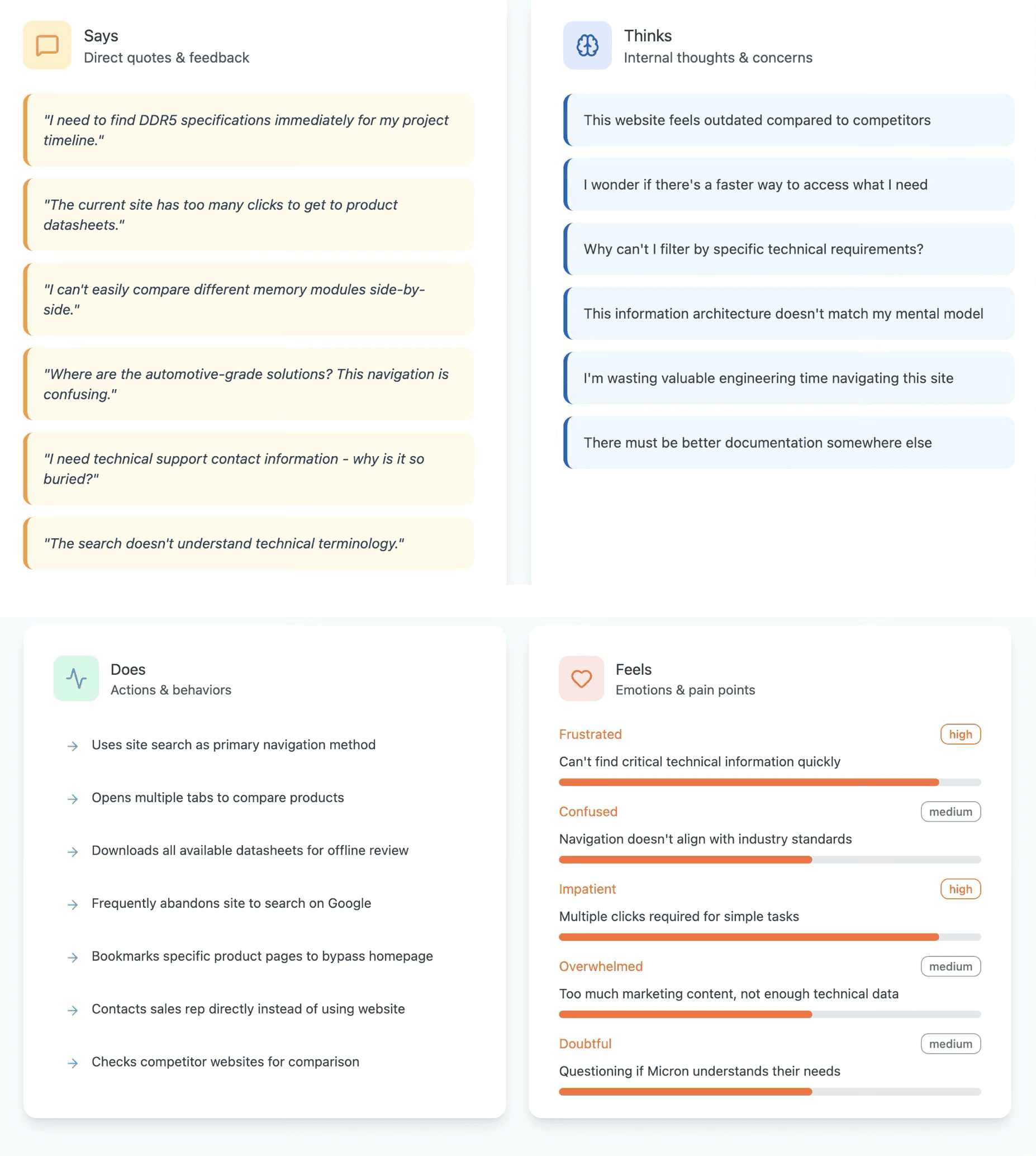
Through interviews, behavioral mapping, and heuristic evaluations, we uncovered friction points such as unclear information architecture, inefficient search, and limited comparison tools that disrupted decision-making and product exploration.
Poor Information Architecture : Technical content buried under marketing layers (High)
Inefficient Search: Search doesn't support technical queries or part numbers (Critical)
Lack of Comparison Tools: No way to compare products side-by-side (High)
Mobile Unfriendly: Technical docs difficult to view on mobile devices ( Medium)
Prototype & Design
I created mid-fidelity wireframes using Adobe XD with guiding text to help stakeholders visualize user flow and information hierarchy. Reviews and input gathered on layout, functionality, and user experience facilitated better design decisions.
After receiving positive feedback on the wireframe's interaction design, I collaborated with the graphic design and development teams to implement the final visual aesthetics, including colors, typography, imagery, and iconography.
Constraints & Trade-offs
To meet WCAG contrast requirements, adjusted brand colors, which limited palette flexibility.
Reduced visual density on mobile to prioritize critical data, foregoing secondary content.
Removed micro-interactions to enhance performance, achieving a balance between user delight and accessibility.
Outcomes & Impact
Engagement: Career page visits increased by 30%, and downloads from the DEI Resource Library rose by 25%.
Accessibility: Achieved full WCAG 2.1 compliance, leading to an 18% increase in usage by screen reader users.
Usability: Reduced mobile bounce rates by 20% and decreased job application drop-offs by 15%.
Efficiency: Streamlined design-to-code cycles by 20% with a unified design system, boosting development efficiency.
Thorough planning, user research, and ongoing monitoring were the key to achieving positive outcomes.